

2023-2024
Classroom Studio
UI&UX Design
Overview
Classroom Studio is a lesson planning tool designed to help K12 teachers create structured and sustainable lesson plans.
In this project, I worked through each step:
Research → UX Mapping → Wireframes → UI Decisions → Testing & Feedback,
ensuring the final product not only solved real educator pain points but also supported sustainable and scalable workflows.
My Role
Conducted early user research, developed wireframes and prototypes, and performed user testing.
Tools
Figma, iMovie
Design Process
The design process involved three major iterations, each informed by teacher feedback, visual refinements, and an evolving understanding of effective lesson-planning tools.
Iteration 1 - From Problem to Product
User Research
SWOT & Strategy Group Mapping are shown below
We began by evaluating the viability of a digital lesson planning tool through early market research. I focused on analyzing similar edtech products and demand across Canadian provinces. Using tools like Strategy Group Mapping, SWOT, and PESTEL, I assessed market gaps, institutional constraints, and growth potential.
The research confirmed strong demand in the Canadian edtech space—and revealed that no existing product offered the same functionality. This validated the opportunity and set a clear foundation for moving into user research.

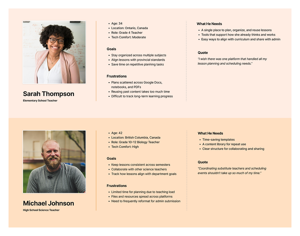
The primary users were K–12 educators in North America, including classroom teachers, instructional leads, and home teachers.
I focused on two main personas:
-
Elementary School Teachers (Grades 1–8) who plan across multiple subjects and often work alone
-
High School Teachers (Grades 9–12) who collaborate more but have less time to plan due to tight schedules
Both groups shared a common need: a planning tool that respects their time, mirrors their workflow, and helps them stay organized over weeks or even entire terms.
Target audience
The images shown below are personas
Mapping the Planning Journey
To define the experience, I created a User Journey Map to visualize a teacher’s typical lesson planning flow. The journey map revealed that planning is rarely linear, and teachers often jump between terms and reuse materials. This shaped a flow where schedules contain lessons rather than fixed subject-first logic.

Key Functions Identified
Based on initial feedback, I scoped and defined core features:
-
Login & Signup: Secure and quick account creation
-
Dashboard: Timeline view, notes, and class list
-
Profile: Editable user info and account controls
-
Lesson Planner: Schedule and subject setup


Wireframes
I created low-fidelity wireframes to test layout, hierarchy, and page flow clarity across these core features.
Zoom to view details
User Testing & Improvement
At this stage, I presented the overall user flow to teachers and explained how the core features would function. Feedback was collected through discussion and observation.
Based on their feedback, I made the following key updates:
UX Adjustments
-
Profile: Reused layout for Forgot Password and Change Password to avoid unnecessary re-learning or navigation effort.
-
Profile: Added a “Reactivate Account” button to recover their account, made the system feel more forgiving and less risky.
-
Lesson Planner: Introduced “Rotate Schedule” option using alternating schedules (e.g. Week A / Week B).
UI Improvements
-
Reduced padding in the banner area and switched to an icon-only nav bar to give more screen space to main content
-
Refined the dashboard layout to improve readability and make key info easier to spot


Iteration 2 - Iterating for Usability & Clarity
Mapping the Planning Journey
To deepen our understanding of how teachers interact with planning tools, I created a User Journey Map based on how users engaged with the first iteration of Classroom Studio. The initial version successfully supported basic lesson planning, but as teachers began working across multiple schedules, they expressed a need for broader visibility and faster access to cross-term information.
The journey map highlighted how teachers often need to view multiple timelines at once, track class progress, and quickly switch between planning and prep tasks. These insights led to key upgrades in the second iteration, especially around the dashboard structure, calendar flexibility, and planning clarity.

Wireframes
1. Dashboard Redesign
-
Calendar:
-
Replaced the vertical timeline with a calendar layout
→ Added week, month, and year toggle views
→ Integrated popovers for fast class and meeting previews
-
-
Class List: Updated progress tracking for each class
-
Search Bar: Introduced a search bar
-
To-Do List: Introduced a clean Add New Task popup with priority and due date options
These changes made the dashboard more scannable and actionable, giving teachers an at-a-glance understanding of their schedule, tasks, and class progress.
2. Lesson Planner Updates
-
Accordion-style units for clearer topic/activity hierarchy
-
Curriculum tags added at topic level to ensure standards alignment
-
Term categories: In Progress / Upcoming / Past with custom lesson colors
-
Step-by-step progress bar added to guide term and lesson creation
Designed to reduce visual clutter, improve structure, and support planning confidence.
3. Profile
-
Updated visuals to match new UI
-
Maintained layout consistency for user familiarity


User Testing
After the second iteration, I ran scenario-based testing with teachers using updated versions of the Dashboard, Lesson Planner, and Profile.
Dashboard
Teachers found the calendar view intuitive and appreciated the week/month toggle. Some asked for more control over the layout, prompting ideas for dashboard customization.
Lesson Planner
Accordion units and progress bars improved clarity. Users wanted easier ways to reuse content and tag curriculum standards.
Profile
Most tasks were completed smoothly. Visual consistency was noted as helpful.
This feedback directly shaped Iteration 3, where I added customizable widgets, curriculum tagging, and other advanced planning tools.
Iteration 3 – Building Flexibility & Communication Tool
After identifying unmet needs in Iteration 2, the team conducted additional interviews to validate what was missing, mainly around collaboration, curriculum tagging, and lesson flexibility. Based on these insights, I introduced dashboard widgets, messaging, curriculum standards side panel, and block schedule. The UI system was also refined for better clarity and consistency across screens.
Key Features Added:
Dashboard Widgets
User Need: Teachers wanted more flexibility to personalize their planning view and prioritize different types of information.
Design Response: I restructured the dashboard into a modular widget system. Each widget (e.g., Gantt chart, class tracker, to-do list) is toggleable and resizable, giving users control over how their homepage supports their workflow. The layout emphasizes clarity through visual hierarchy and spacing.
Curriculum Standards
User Need: Teachers needed a simple way to ensure lessons aligned with provincial or school-wide curriculum requirements.
Design Response: I added a lightweight tagging system for both units and topics, allowing teachers to select relevant standards from a side panel. Tags remain visible but unobtrusive, making alignment clear without disrupting the planning flow.
Messaging
User Need: Teachers wanted a simple way to communicate and share files without leaving the platform.
Design Response: I introduced a familiar and chat-style messaging system to reduce the learning curve. The interface mirrors standard messaging apps, allowing teachers to start conversations and share content instantly with minimal friction.
Block Schedule
User Need: Many schools operate on block or rotating schedules, which couldn’t be visualized easily in the original planner.
Design Response: I designed a drag-and-highlight grid view where teachers can assign classes to flexible time blocks. The visual pattern supports non-linear schedules and gives teachers a more tactile sense of time allocation.
User flow
The following user flow outlines the structure of Version 3 Classroom Studio. The goal is to help a teacher create, reuse, and organize a lesson efficiently.
Zoom to view details

Log In & Sign Up

Dashboard

Account Settings

Messaging

Wireframes
Zoom to view details
Lesson Planner - Create a Lesson

Lesson Planner - Create a Term & Schedule

Lesson Planner - Create a Class

User Testing
User testing extended beyond the design phase. Post-launch, feedback was collected from teachers actively using the platform in their daily planning routines.
This in-the-wild feedback uncovered bugs, usability issues, and feature requests that hadn’t surfaced during earlier design reviews. These insights helped us focus updates around how the product was truly being used, such as adding widget customization, allowing term renaming, and improving scheduling tools.

Final Design
The final design integrated all functional and visual elements into a cohesive product experience, balancing practicality with user-friendly aesthetics tailored for educators.
UI & UX Highlights:
-
Customizable dashboard with flexible widgets
-
Responsive for desktop and tablet
-
Reusable content model (Lessons → Classes)
-
Color-coded views, contextual feedback, and reduced load time


Dashboard Widgets
Each widget gives teachers a focused view of schedules, tasks, or class progress. The structure supports routine visibility and micro-decisions, using strong visual hierarchy and minimal distractions to keep teachers in flow.


Curriculum Standards
Teachers can select standards from a side list and attach them to specific units or topics. This keeps curriculum alignment clear and accessible without interrupting the planning flow.


Messaging
Built-in messaging allows teachers to communicate and share files within their planning context without switching tools.
Designed for low cognitive load, the layout favors clarity over chat clutter, and threads are tied to real teaching content like schedules or shared lessons.


Block Schedule
Teachers can highlight time blocks by click-dragging across the grid, then assign classes with a single click. By using visual patterns and direct manipulation, the design reduces setup friction and gives teachers a more physical sense of control over time.
Style Guide
I developed a brand system focused on clarity and approachability:
-
Typography: Rounded sans-serif fonts for readability and warmth
-
Color palette: Soft, school-appropriate tones with light accent colors to guide focus
-
UI Components: Simple, spacious layouts with consistent spacing and hierarchy


Character Design
To add warmth, especially for younger-grade teachers, I illustrated a set of friendly, soft-edged characters used across onboarding, empty states, and tooltips. These elements bring charm to the product without distracting from its core purpose.
Reflection
This project showed me how varied teacher workflows can be. Some prefer flexibility, while others need clear, linear paths. I learned to build for both—supporting open-ended planning while guiding those who need structure.
I also learned to design beyond just tools. Classroom Studio gave me the opportunity to work across different interface types, from task-based planners to communication flows, and into an e-commerce experience that is currently in development.
These shifts sharpened my ability to adapt UX principles to different user needs and content formats while staying true to clarity and usability at every step.
More projects


